Here’s a pattern that probably feels familiar.
Someone signs up for your product. You can see them in your analytics. They poke around for a few minutes, maybe click into one or two things, and then they just… leave. They don’t cancel dramatically. They don’t send an angry email. They disappear.
Six weeks later you’re staring at your churn numbers trying to figure out why a person who clearly had enough interest to sign up didn’t stick around long enough to get value from what they signed up for.
Most of the time the answer isn’t that your product is confusing. It’s that nobody showed them what to do first, fast enough, in a format they’d actually engage with.
That’s the job of a customer onboarding video, and it’s a more specific job than most SaaS teams treat it as.
Why Onboarding Videos Are a Different Problem Than Tutorial Videos
Tutorial videos answer questions users already know they have. Onboarding videos answer questions users don’t know they need to ask yet.
The distinction matters because the intent behind each is completely different. A user searching your help center for “how do I export a report” is oriented. They know what they want and they’re looking for the path. A user who just signed up doesn’t know what to want yet. They need to be oriented before anything else can happen.
That orientation job is what makes onboarding video its own strategy, not just a renamed how-to guide. The content, the length, the placement, and the framing all serve a different purpose.
The Four Videos You Actually Need
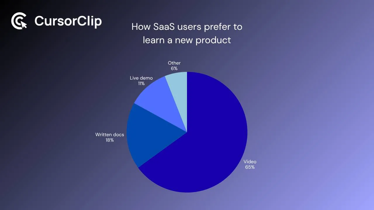
The biggest mistake SaaS teams make with onboarding video is trying to make one video that explains everything. What you get is a 7-minute product tour that users abandon two minutes in.
The better structure is four distinct video types, each with a specific job at a specific point in the user journey.
| Video Type | Length | Job | When It Appears |
|---|---|---|---|
| Welcome video | 30 to 60 seconds | Build trust, set expectations, give one clear first action | Immediately after signup |
| First-run walkthrough | 60 to 90 seconds | Get the user to their first win | Day 0 to 1, welcome email or first-login modal |
| Feature spotlight | 45 to 75 seconds | Drive adoption of one specific feature | Triggered contextually in-product |
| Help center tutorial | 90 to 180 seconds | Self-serve support for specific tasks | Knowledge base |
The Welcome Video
Short, human, and nothing to do with features. This is a 30 to 60 second video, ideally from the founder or someone on the team, that says: here’s what you’re working with, here’s the one thing to do first, and we’re glad you’re here.
The goal isn’t to explain anything technical. It’s to make the user feel like they made a good decision by signing up and give them a clear first action. Show your face if you can. Warmth at this stage pays off in retention later.
The most common mistake: turning the welcome video into a feature tour. The person watching already signed up. They don’t need to be sold again. They need to be welcomed and pointed somewhere specific.
The First-Run Walkthrough
This is the workhorse of your onboarding library. One video, one workflow, one outcome, from “I just logged in and have no idea where to start” to “I just did the thing and it worked.”
The frame that makes this easier to build: your job isn’t to show them everything. Your job is to get them to their first win as fast as possible. Time-to-value is the variable that predicts whether someone becomes an active user or a churn statistic. The walkthrough video is your most direct lever on that number.
Keep it to the critical path only. If there are three ways to do something in your product, show the simplest one. The others can live in the help center.
Feature Spotlight Videos
Short, contextual videos that live next to specific features, in a tooltip, a modal, a side panel. They answer exactly one question: “What does this do and when would I use it?”
The reason they’re valuable isn’t the content itself. It’s the timing. A feature spotlight shown when the user is actively looking at the feature and wondering what to do with it is worth ten of the same videos sitting in a help center nobody opens. Context is the whole point.
Prioritize feature spotlights for features with high abandonment, features that unlock significant value but aren’t obvious, and anything your support team explains repeatedly in tickets.
Help Center Tutorials
These are your evergreen, task-based explainers: “how do I connect my workspace,” “how do I export this,” “what’s the difference between X and Y.” They can run a bit longer because users who reach your help center are actively trying to solve something specific. They have patience. Give them precision.
Help center tutorials are the fallback layer of onboarding, not the primary one. Users who end up here are already confused. You want to intercept them earlier, before they need to go looking.
Where Each Video Lives in the User Journey
The content of the video matters, but placement is half the job. A solid onboarding video sitting in a help center tab that users never open does almost nothing.
Right After Signup: Welcome Email
Your first email to new users is the highest-open email you’ll ever send. Include or link your first-run walkthrough here. Even a static thumbnail with a play button performs significantly better than text instructions alone. This is where the majority of users who will ever watch your onboarding content will encounter it.
First Login: In-Product Modal or Banner
A modal that presents the walkthrough on a user’s very first session removes the “what do I do now?” moment before they even have a chance to feel it. Don’t autoplay with sound. Use click-to-play with a clear thumbnail and a headline that tells them what they’ll learn in concrete terms, not “Welcome to [Product]” but “How to set up your first [core action] in 90 seconds.”
In-Product Contextually: Feature Spotlights
These work best when they’re literally adjacent to what they explain. Embed them in tooltips or side panels on features with high drop-off or high support volume. When a user pauses on an unfamiliar UI element and a small video appears offering to explain it, they’re far more likely to watch because the question and the answer arrive at the same moment.
Help Center: Tutorials
Yes, here too. But think of this as the catch-all layer, not the primary delivery point. Users who reach the help center are already in a friction state. The goal is to resolve it quickly and specifically, not to onboard from scratch.
How to Structure Each Video So It Actually Works
The structure that works for onboarding video is different from tutorial content because the user’s orientation level is different.
Welcome video structure:
- 0:00-0:10: Who this is from and what the product just did for them
- 0:10-0:45: The one thing to do first, stated plainly
- 0:45-0:60: What happens next and what they should expect
First-run walkthrough structure:
- 0:00-0:10: Name the outcome clearly
- 0:10-1:10: Walk the critical path only
- 1:10-1:30: Show what “done” looks like explicitly
- 1:30-1:45: Give one next step, named specifically
Feature spotlight structure:
- 0:00-0:10: Name the feature and when you’d use it
- 0:10-0:50: Show it in use in a realistic context
- 0:50-1:00: Show the outcome it produces
The common failure mode across all three is assuming too much familiarity. Onboarding viewers are new to the interface. Every step needs to be named before it happens, not explained after. If your structure assumes familiarity, it’s tutorial content, not onboarding content.
If you are recording those walkthroughs on macOS, this guide covers what to look for in a screen recorder for SaaS demos on Mac.
CursorClip, the Mac recorder we make, is built for this. It zooms in on your clicks automatically, so the small UI steps a new user needs to see stay readable.
Video Length Targets (and Why They’re Not Arbitrary)
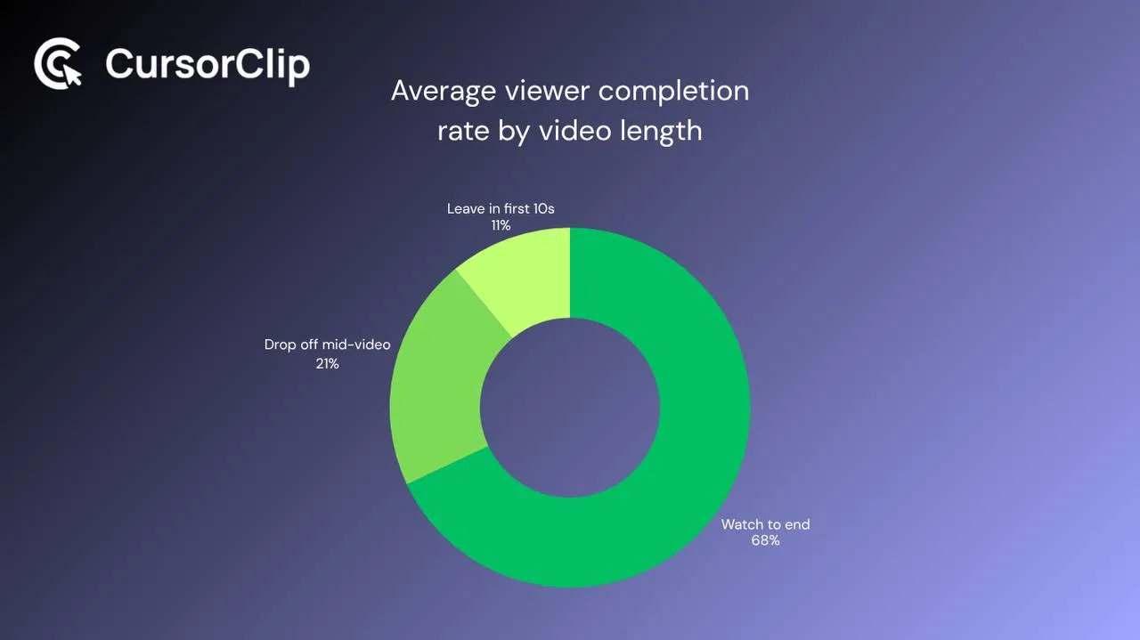
Keeping videos short isn’t just about attention spans. It’s about maintainability. Your product will change. A 4-minute first-run walkthrough that needs re-recording every time you ship a meaningful UI update is a maintenance burden that eventually just goes stale. A 90-second video can be re-recorded and replaced quickly.
| Video Type | Target Length | Hard Cap |
|---|---|---|
| Welcome video | 30-45 seconds | 60 seconds |
| First-run walkthrough | 60-90 seconds | 2 minutes |
| Feature spotlight | 45-60 seconds | 75 seconds |
| Help center tutorial | 90-120 seconds | 3 minutes |
If you’re going over these targets consistently, the problem usually isn’t that you have too much to cover, it’s that you’re not splitting content into separate videos aggressively enough.
Maintaining Your Onboarding Video Library as the Product Changes
This is the part most SaaS teams skip until they have a library full of outdated content pointing at UI that no longer exists.
Map every video to what it covers. Keep a simple spreadsheet: video name, URL, which feature or workflow it covers, and the date it was last reviewed. When you ship a significant UI change, you can audit in five minutes instead of rewatching everything from scratch.
Review before shipping, not after. When a change is in staging, check whether any existing video shows the thing you’re changing. A 2-minute audit before launch is much cheaper than a user opening a ticket because your help video shows a button that moved three weeks ago.
Set a review cadence for evergreen content. Welcome videos and first-run walkthroughs should be reviewed every quarter even if nothing major changed. Language gets stale. Flows get optimized. What was the “first win” six months ago might not be the right entry point today.
Version, don’t delete. When you re-record a video because the product changed, keep the old file archived somewhere. If you ever need to support users on older versions or investigate a support complaint, having the previous version available is useful.
Watch your completion data. A first-run walkthrough with a 30% completion rate is telling you something specific, either it’s too long, the opening isn’t landing, or it’s not showing up at the right moment in the journey. Completion rate is one of the most useful metrics for onboarding video. Track it from day one.
How Many Videos Do You Actually Need to Start?
Three is a reasonable minimum: a welcome video, a first-run walkthrough, and one feature spotlight for whatever feature trips users up most often. That’s enough to meaningfully improve early activation without turning this into a content production project.
Get those three in front of new users, welcome video and walkthrough in the first email, spotlight in-product, and watch your activation numbers for 30 days before building more. The data from those three will tell you exactly what to make next.
Most growing SaaS products end up with 10-20 onboarding videos over time. But you don’t need to get there to start seeing impact. Start narrow, distribute well, and let usage data drive what you build next.
Frequently Asked Questions
Should I show my face in onboarding videos?
For the welcome video, yes if you can. A real face builds trust faster than a screencast alone, it makes the product feel like something people made. For feature walkthroughs and help center tutorials, a screen recording without webcam is fine. Save the face-to-camera format for the moments where personal warmth matters most.
What if my product ships updates constantly?
Keep videos short enough that re-recording is fast, and build the audit habit into your shipping process rather than treating it as a separate maintenance task. Map your videos to the features they cover so you know immediately which ones are affected when something changes.
Where should I host onboarding videos?
Use a host that gives you reliable playback, easy embedding, and at least basic viewing analytics. What matters most is that you can place videos in email, in-product surfaces, and your help center, then see whether people actually watched and how far they got.
How do I know if my onboarding videos are working?
Track play rate and completion rate at minimum. Then go one level deeper and compare activation rate for viewers versus non-viewers. If users click play but rarely finish the first-run walkthrough, the issue is probably length, placement, or the opening. If they finish it and still don’t activate, the problem is likely the flow itself.
How often should I update onboarding videos?
Welcome videos and first-run walkthroughs should be reviewed quarterly at minimum. Feature spotlights should be reviewed any time the feature they cover ships a meaningful UI change. Help center tutorials follow the same rule: if the UI in the video no longer matches the product, it’s doing more harm than good.
The compounding effect of good onboarding video is simple: the video you record once works for every user who signs up after it. When you onboard users manually, on calls, in Slack threads, writing out the same explanation for the 40th time, you spend the same effort on user 200 as you did on user 2. Good onboarding video doesn’t scale that way.
Start with the welcome video. Record the first-run walkthrough. Get both in front of new users in the first 24 hours after signup. Then watch what happens to your activation numbers over the next 30 days.
That’s the whole pitch.
If you’re also working on other video formats, these guides cover related ground: how to make a SaaS demo video, how to make tutorial videos on Mac, and how to make a feature announcement video.
CursorClip is a native Mac screen recorder with built-in auto-zoom, which helps keep walkthroughs focused and readable without a full editing pass.