You shipped the redesign. New nav, tighter layout, that button everyone kept missing finally moved somewhere logical. Your users need to know, but half your help docs now show a UI that no longer exists, your onboarding video starts with a screen that looks nothing like what new signups see today, and your last changelog tweet got four likes.
This is the product update video problem, and it’s messier than most teams admit.
The challenge isn’t just making a video. It’s making one that actually shows what changed, makes the change feel intentional and valuable, and doesn’t take three hours to produce every time your designer moves a button. This guide covers exactly how to do that, from planning what to show, to recording it on Mac without losing your mind, to structuring it so users actually watch the whole thing.
Why Most Product Update Videos Miss
Before getting into the workflow, it’s useful to look at why so many product update videos fall flat, even when the update itself is genuinely good.
They show features, not outcomes. “We redesigned the settings page” tells users what you did. “You can now find your billing info in two clicks instead of six” tells users what they get. These are different videos, and only one of them gets watched.
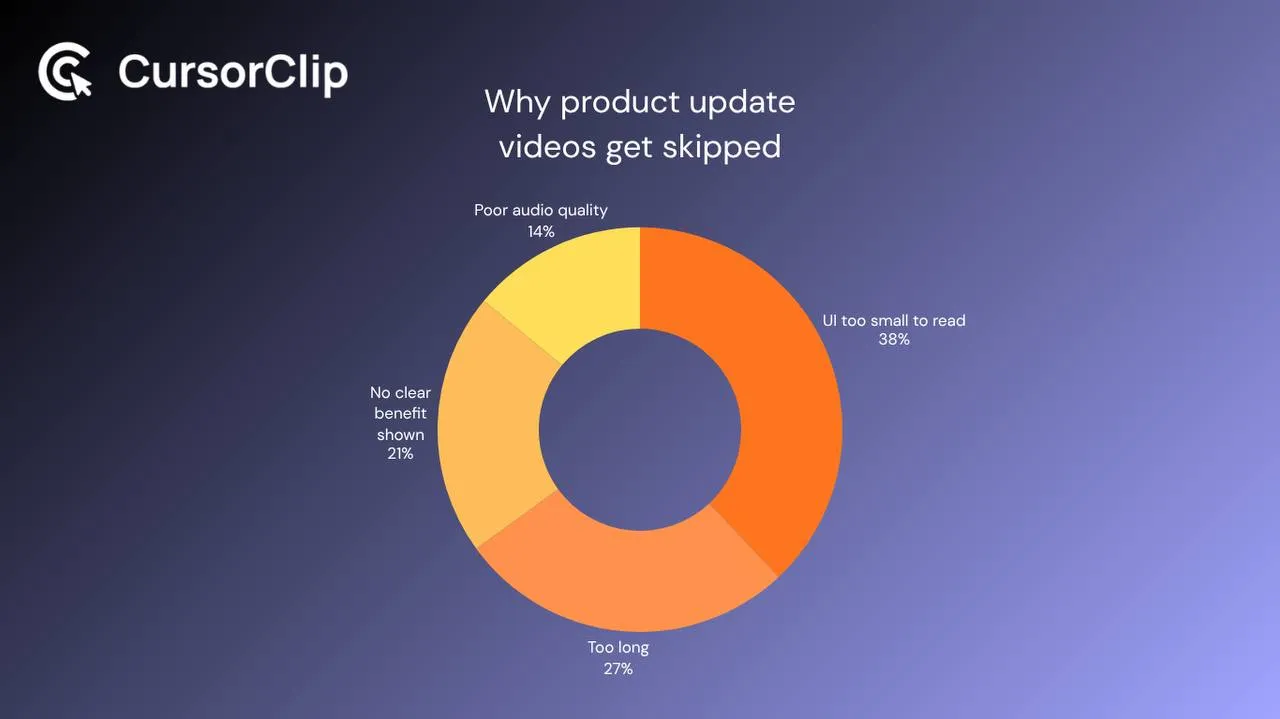
The UI is too small to read. This is the big one. Someone records a full-screen walkthrough, the new nav bar is a thin strip across the top of a 1440p display, and viewers are left squinting at pixels while the narrator says “as you can see here.” Nobody can see. That’s the problem.
They’re too long and too comprehensive. A product update video is not a tutorial. It’s a highlight. The goal is to make users aware and curious, not to document every edge case. The moment your update video crosses four minutes, you’ve lost half your audience.
The old UI is still everywhere. You make a great video for the new flow, but your help center still shows screenshots from version 1.2, your onboarding sequence still sends people through a flow that no longer exists, and support tickets start coming in from confused users who followed the old guide. The video was the easy part.
What a Good Product Update Video Actually Does
A product update video has one job: make the user feel like the change was made for them. Not “look what we built,” but “we noticed this was frustrating. Here’s what we did about it.”
That reframe changes everything about how you structure the recording. You’re not demoing a feature. You’re narrating an improvement.
The best update videos follow a simple three-beat structure:
- Name the old frustration, not the feature, the pain it caused
- Show the new flow, walking through the updated UI in real time
- State the payoff explicitly: what the user can now do faster or better
That’s it. Two minutes, three beats. Everything else is optional.
The Zoom Problem (And Why It Matters More Than You Think)
Let’s talk about the thing that kills more product update videos than anything else: the full-screen, un-zoomed recording.
When you record your entire Mac display and export it at standard resolution, every UI element (buttons, labels, navigation items) is rendered at the same size it appears on your screen. On a 13-inch laptop? Readable. On a 16-inch MacBook Pro? Already getting small. On an external display? You’re now asking your viewer to locate a 12px font label in the upper-right quadrant of a 1920×1080 frame.
This isn’t a theoretical problem. It’s the reason people pause, rewind, and eventually just email support.
The fix used to be manual: record the walkthrough, open it in an editor, add keyframe zooms at every relevant click, adjust timing, repeat. For a 90-second update video, that editing process could easily run 45 minutes.
That’s where tools with automatic zoom tracking genuinely change the workflow. CursorClip, a native Mac screen recorder, tracks your cursor and applies smooth zoom and pan to the active area of the screen as you record. When you click the new navigation item, the video frames around it. When you open a dropdown, the video zooms in on the dropdown. You get a focused, readable recording without touching a timeline.
For product update videos specifically, where you’re often demoing small UI changes like a repositioned button, a new modal, or a redesigned settings panel, this matters a lot. The whole point of the video is to show what changed. If users can’t see it clearly, you’ve wasted the recording.
Planning the Recording: What to Actually Show
Here’s a question most people skip: what exactly are you showing, and why?
Not every UI change deserves a video. Some changes, like a color tweak, minor copy edits, or backend improvements with no visible interface impact, are better served by a changelog entry. Videos are for changes where seeing the new behavior is materially different from reading about it.
Use this filter before you plan any recording:
| Change Type | Video Worth It? | Better Format |
|---|---|---|
| Redesigned workflow (3+ steps changed) | Yes, show the full flow | 60 to 90 second walkthrough |
| New feature with non-obvious value | Yes, show the use case | 2 to 3 minute demo |
| Repositioned UI element (button moved) | Sometimes, 30-sec clip | Annotated screenshot is fine |
| New modal or settings panel | Yes, show it being used | 45 to 60 second clip |
| Performance improvement | No | Changelog + metric |
| Color/typography refresh | No | Before/after screenshot |
| Copy changes | No | Release note |
| New integration | Yes, show the connection flow | 2 minute walkthrough |
Once you’ve decided a video makes sense, write down the single sentence that starts with: “After this video, the user will understand that they can now ___.”
If you can’t write that sentence cleanly, you don’t have a clear enough scope for the recording. Clarify the scope before you touch the record button.
The Before/After Technique
One of the most underused approaches in product update videos is showing the old way before you show the new way.
Most teams skip this because it feels counterintuitive. Why show users something you just removed? But the before/after structure does something important: it creates contrast. Without contrast, improvements are invisible. If a user never saw how many clicks the old flow took, the new three-click flow just feels normal.
The technique is simple:
-
Start with a quick 15-second walkthrough of the old flow, narrating the pain point: “Before, to do X, you had to go here, then here, then scroll down to find this…”
-
Cut directly to the new flow: “Now it’s right here. One click.”
You don’t need to re-record the old UI if you don’t have it. You can describe it verbally while showing the new interface. The contrast still works because you’re naming the friction before resolving it.
If you do have a recording of the old flow, even a rough one, the side-by-side or sequential comparison is genuinely powerful for changes where the improvement is obvious once you see both.
Recording the Update on Mac: The Actual Workflow
Here’s how to set up and record a clean product update video without spending your afternoon on it.
Before you start:
-
Turn on Do Not Disturb (Control Center → Focus → Do Not Disturb). Non-negotiable.
-
Close anything not relevant to the flow: browser tabs, Dock apps, anything that could pull attention or appear in a recording accidentally.
-
If you’re showing a specific product area, zoom your browser to 110 to 125% before recording. This makes UI elements bigger in the output without changing your display resolution.
-
Do a 15-second audio test. Play it back. If you can hear your fan or the room sounds like a bathroom, fix it before you record the real thing.
Recording the update:
Use a recorder with auto-zoom if you have one, CursorClip is the Mac-native option built for exactly this kind of walkthrough. If you’re using a tool without zoom, record at a lower resolution or crop to the specific app window rather than the full display.
Narrate before you click, not after. “I’m going to click Account Settings here” gives viewers a moment to look for the element before you activate it. If you narrate after clicking, they’re always a beat behind and the video feels rushed.
Move your mouse deliberately. Fast, erratic mouse movement, even with good zoom tracking, is hard to follow. Slow, intentional cursor movement makes the recording easier to watch and gives the zoom logic time to frame the right area.
Record the whole thing in one take if possible. Product update videos are short enough that a single clean take is usually achievable, and re-recording is faster than editing dead air out of a multi-take session.
After you record:
Trim the first and last five seconds. Most recordings start with two seconds of nothing while you find your place and end with the recording still running while you find the stop button. Those seconds create a weird, amateur opening and closing that undercuts an otherwise clean video.
That’s the entire edit for most update videos. If you’re using auto-zoom, the framing is already done. If you’re not, this is where you spend time adding manual zoom keyframes, which is why auto-zoom is such a practical advantage for teams that do this regularly.
How to Structure the Video Around What Changed
The actual script (or outline) for a product update video is short. Here’s a template that works:
Opening (10-15 seconds): Name the old problem, not the new feature. “Finding your API keys used to mean hunting through three different settings panels” is a better opener than “We’ve updated our settings navigation.”
Show the new flow (60-90 seconds): Walk through the updated UI in real time. Narrate each step before you take it. Show the complete workflow from start to finish, not just the changed element in isolation. Users need context to understand why the change helps.
Show the payoff (10-15 seconds): Explicitly state what this means. “That’s the new flow, from zero to connected API in under a minute.” Don’t leave users to infer the value. Name it.
Optional CTA (10 seconds): If there’s a specific action you want users to take, try the new feature, update their settings, check out documentation, say it directly at the end.
Total runtime: 90 seconds to 2 minutes. That’s the sweet spot for update videos. Long enough to show the change clearly; short enough that users watch the whole thing.
Where to Distribute the Update Video
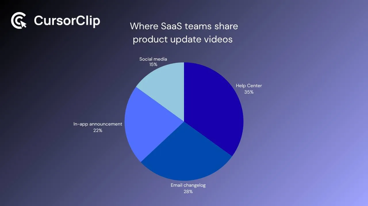
A great product update video in the wrong place doesn’t help anyone. Distribution matters as much as production.
| Channel | Best For | Format |
|---|---|---|
| In-app announcement / modal | High-visibility, catches active users immediately | Short looping clip or 60-sec video |
| Email changelog | Users who opted into product updates | Embedded thumbnail linking to full video |
| Help center / docs | Long-term discoverability, support deflection | Full video + written steps underneath |
| LinkedIn / Twitter | Brand building, attracting new users | Same video, slightly more polished hook |
| Slack communities / forums | Niche distribution to engaged power users | Direct share with context |
One thing a lot of teams miss: update videos have a longer shelf life than you’d think if you host them on your help center. Someone discovering your product six months after you shipped a major redesign will find that video, and it tells them that you ship, that you communicate changes, and that you care about the user experience. That’s worth more than a few extra social shares.
Keeping Update Videos from Going Stale
The challenge with any product video is that UIs change. The video you made last quarter might already show a flow that no longer exists.
A few practical rules to avoid the stale video problem:
Record short and specific. A 90-second video showing one specific workflow ages better than a 5-minute overview that touches everything. When one small thing changes in your product, you only need to re-record one short video, not redo the whole library.
Add a “Recorded in [Month Year]” timestamp to your video titles in your help center. This is a subtle but useful signal for users, they know they’re watching a recent recording and can flag it if the UI looks different.
Set a calendar reminder every time you publish a video. Three months from the recording date, spend five minutes checking whether the flow still looks the same. If it does, great. If not, re-record. With a tool like CursorClip where there’s no editing involved, re-recording a 90-second walkthrough takes about 10 minutes total.
Re-record only what changed. You don’t need to redo an entire onboarding video because you moved one button. Record a short 30-second “update” clip and link to it from the original. Most users who are confused won’t watch the whole thing anyway, they’ll scan for the part that doesn’t match what they see.
What to Look for in a Screen Recorder for Product Update Videos
Not all screen recorders are built for this kind of work. Most are designed around either casual capture (QuickTime-style record-and-dump) or heavy production (full timeline editors with tracks, transitions, and export presets). Product update videos fall in neither camp, they’re short, frequent, and need to look polished without taking an hour to edit.
Here’s what actually matters when you’re choosing a tool for this specific job:
Auto-zoom on cursor movement. This is the single biggest factor for legibility. If the tool doesn’t frame around your cursor automatically, you’re adding manual keyframing to every recording. For a 90-second video, that’s 20-40 minutes of editing you’re doing over and over again every release cycle.
Native macOS build. Several popular recorders are built on Electron, which ships a copy of the Chromium browser engine inside the app. Screen Studio and ScreenCharm are two examples: each one’s own Mac update download contains the Electron framework (checked 2 October 2026). A native app has no browser engine to load alongside the product you are demoing. If you record on a Mac regularly, it is worth checking what your recorder is built on, and what it uses in Activity Monitor while you record.
No subscription required. Update videos are a long-term habit, not a one-time project. A subscription on a tool you use to record two-minute videos every sprint is a cost that compounds quietly. A one-time purchase makes more sense for this use case.
CursorClip is built specifically around these requirements, native Mac, automatic zoom tracking, one-time purchase at $70. For teams doing regular update videos without a dedicated editor, it removes the friction that causes update video habits to die after the first month.
If you are choosing a recorder for polished SaaS walkthroughs more broadly, start with the Mac screen recorder for SaaS demo guide.
FAQs
How long should a product update video be?
90 seconds to 2 minutes for most UI changes. If you’re shipping a genuinely large update that affects multiple workflows, 3 minutes is acceptable, but be strict about it. Anything longer and you’re making a tutorial, not an update video. Those serve a different purpose and should be separate.
Should I show the old UI before the new UI?
When the improvement is meaningfully visible, yes. The before/after contrast is one of the most effective ways to communicate the value of a change without relying on users to imagine what was frustrating about the old way. Keep the “before” section short, 15-20 seconds is enough.
Do I need to be on camera for a product update video?
No, and for most UI-focused update videos, it’s better to stay off camera. A face bubble takes up screen real estate that would be better used showing the actual product. The exception: if you’re the founder or a recognizable face at your company and you want the update to feel personal, a brief opening on-camera (5-10 seconds) before cutting to the screen recording can add warmth.
What’s the right screen resolution to record at for product update videos?
If you’re recording your full display, 1920×1080 is the standard. But for update videos specifically, where legibility of small UI elements is critical, consider recording at 1440×900 or zooming your browser to 110-125% before you start. Better still: use a recorder with automatic zoom so the resolution of your display becomes less of a factor.
How often should I make product update videos?
For meaningful UI changes and new features: every time. For minor tweaks and bug fixes: a written changelog is fine. A rough rule of thumb, if you’d personally walk a user through the change in a support call, make a video. If you’d just mention it in a bullet point, write a changelog entry.
My product just had a major redesign. Should I re-record everything?
Yes, but prioritize by traffic. Look at which help center articles and onboarding flows get the most views, then re-record those first. A major redesign is a good opportunity to audit what videos you actually need, because most products accumulate video content that covers edge cases nobody ever watches.
Can I use the same video for social media and my help center?
Often yes, with minor adjustments. The core recording can be the same, the difference is the framing. Your help center version can be longer and more detailed; the social version should have a tighter hook in the first three seconds and possibly captions (most social video is watched without audio). Export both from the same recording session.
The Honest Summary
Product update videos are one of the highest-leverage things a small SaaS team can do consistently. They reduce support tickets. They increase feature adoption. They make your changelog feel alive rather than like a list of maintenance notes nobody reads.
The reason most teams don’t do them well isn’t effort, it’s friction. The recording feels tedious, the editing takes forever, and by the time the video is done the next release is already in staging.
The teams that pull this off consistently are the ones that lowered the cost of production: shorter videos, clear structure, tools that handle the zoom automatically so there’s no edit queue. When a 90-second update video takes 15 minutes to produce from outline to export, it becomes something you can actually do every sprint instead of something you mean to do eventually.
That’s the bar worth aiming for.
If you’re also working on other video formats, these guides cover related ground: how to make a SaaS demo video, how to make tutorial videos on Mac, and how to make a feature announcement video.
CursorClip is a native Mac screen recorder built for product demos, UI walkthroughs, and update videos. It auto-zooms on your cursor as you record, no timeline editing required. Recording and editing are free. A lifetime license to export is $70, with a 14-day money-back guarantee.